
Measures of Community
So for this amazing project we basically had to be focusing on observing data carefully, and coming up with a reasonable conclusion of the data shown. So in order to make this possible, we had to come up with questions that were going to be in a survey that all the ninth graders had to take(or at least the people on my team, Erin/Jocelyn team). Since the topic I wanted to be focusing on was music, I had to ask music related questions. Like, For how long do you listen to music? or What's your favorite band/singer? After everyone took the survey I had to be analyzing their answers. I grouped the data based off of the amount of time they spent listening to music, and the genre that was most common among us. After we had all of the gathered data we had to make pie charts, scatter plots, graphs, and you get the point, right? Afterwards we had to put all of the data into an infographic. That wasn't so easy to do. Why? Well because the infographics had to LOOK interesting and cool, not boring and lame. You'll be blown away by some of the finalized results, some people are really creative!!!
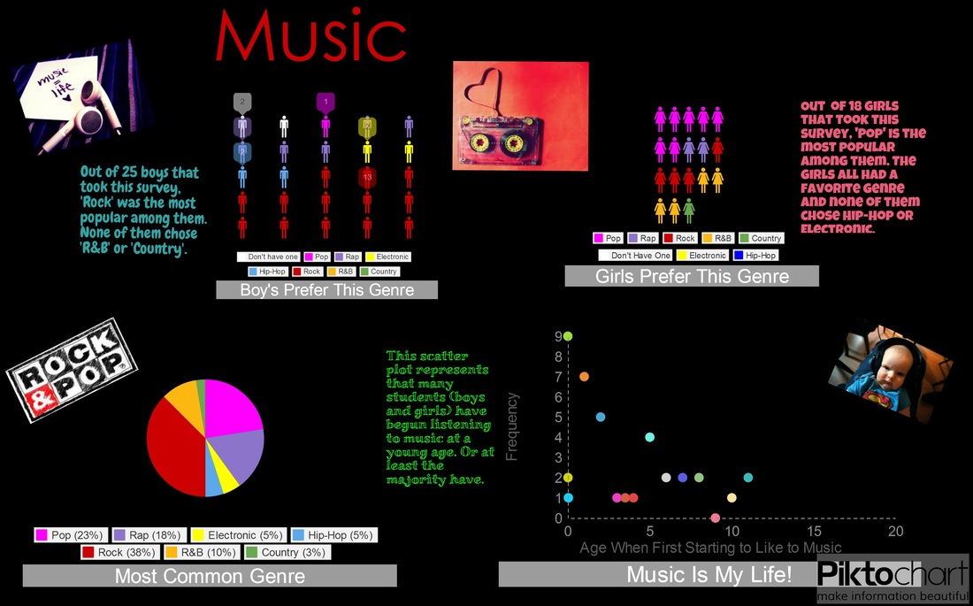
So something that I actually remember about the observations that I made. It was that the most popular genre (or most common genre, however you want to put it), was Rock and Pop. The least common genre was Country...how sad, oh well. I also came to the conclusion, by looking at the data, was that if you started liking music at a younger age, then you were/are more likely to listen to it more in a week. Some of you guys may be wondering, So why did you decide to choose music as your main focus, why not something else? My answer would be: Maybe it's the reason because I like music a lot, and because I just wanted to...
So yeah, thanks for everyone that read this without falling asleep, and I just want to give you a round of applause for that as well *claps frantically*, oh and let's not forget the fireworks *throws fireworks in the air*. So yeah, this was one of my first projects in Math/Science, I hope you enjoyed reading this!!!!!
This is my Infographic!
